People Analytics – from Florence Nightingale to Storytelling
“Statistics should be the driest of all reading.”
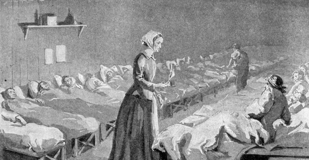
When Florence Nightingale reached out to her old mentor, William Farr, for help developing her now world famous report on the mortality of British soldiers in the Crimea, this was his response. She wanted to use graphs, and charts, of all kinds of colours and sizes. She didn’t want any excuses for not understanding what she was trying to say.
He was aghast at the idea. Carefully penned tables filled with hundreds and hundreds of cramped numbers and little footnotes were the only proper way to present something as vital as data. Why profane it with gaudy pictures?
Nightingale saw through this snobbery. She realised that the world was changing and data analytics couldn’t be circulated solely through appreciative circles of academics that might, might, end up passing on a titbit of useful information to friends in high places. It couldn’t just slide off the desk of a desperately bored MP, eyes glazed over as he scanned page after page of tiny rows of numbers trying to work out why this report had even been handed to him.
[Tweet “Nightingale’s achievement was her use of data visual to convince. We need a new Nightingale.”]
People were dying. She needed others to sit up and pay attention. She created her graphs, laboured over the colour-coding, and sent it off. The visual techniques she used to communicate the (dry) truths she found in the data she collected told a story. A powerful one. A story so compelling and ground breaking due to its accessibility that it did exactly what she desired – it reached the public and was the catalyst to significant action.
Result: The mortality rate dropped from 52 percent to 20 percent. She saved the lives of tens of thousands of people.
Many believe her to be the inventor of the pie-chart. She actually used a polar, not a pie chart, but close enough, and she is also known as the Mother of Visualisation – a now critical element of Analytics.
The rise of People Analytics has begun but, as can be seen from the Florence Nightingale example, data on its own has little value. We also know that the Analyst is not the end decision maker – that’s the role of Business and HR Leaders. Pie charts and graphs are now common place and the expectation has moved from Visualisation to a newer concept called Data Storytelling. It still incorporates data and Florence’s visuals but Data Storytelling involves a third element – a narrative.
A narrative helps to contextualise the data and visuals, to engage, enlighten and compel. A good narrative must also be memorable. Mathematician John Allen Paulos observed – “In listening to stories, we tend to suspend disbelief in order to be entertained whereas in evaluating statistics, we generally have an opposite inclination to suspend belief in order not to be beguiled.”
[Tweet “People have been trained to distrust statistics. We need new kinds of storytelling to create change.”]
If People Analytics (or any analytics for that matter) is to truly succeed, merely having people adept at sourcing and analysing data is only the first step. We need to suspend disbelief, move hearts and minds, and create actionable change.
But how can you create such a compelling narrative so that you get the full attention of your Business and HR Leaders and convince them to buy into your ideas?
Here are some tips:
- Asking a question. A compelling story usually begins with a question. For example you could be asking which key performance indicators are the most important or what is your biggest business challenges? Remember, a good question is one with a quantifiable dimension that allows you to answer it using your data.
- Knowing your audience. Being aware of your who you are presenting your story to will allow you to frame your narrative effectively. Are you presenting it to your immediate manager or to a C-suite level audience? An immediate manager may wish to go into the details whereas a C-suite audience might only need a summary of the most important actionable items. Tailoring your narrative to suit your audience is key to effective communication.
- Staying objective. It is easy to fall into the bias trap, especially when you are arguing to influence. It is also tempting to be consciously selective about the use of data so that you present only what you want your audience to see. However, remember that presenting an overly positive outlook may not help your cause – especially when your audience will likely hold you to these forecasts in future!
We’ll be discussing and workshopping this and more at the People Analytics & the Future of Talent conference in Sydney on 17 & 18 October. Secure your seat now.

Related articles


About Jo Vohland
I'm the Swiss Army Knife of Talent: Talent Acquisition, People Analytics, Psychometrics, Graduate Programs, Learning and Development and Career Transitions. I spend my days working with a Talent Futurist and Industry Stalwart and talking to ANZ's brightest talent minds. I also have the joy and honour of working on the largest talent event in the Southern Hemisphere.
View more articles by Jo VohlandConor O'Grady

About Conor O'Grady
Conor works with BK keeping the motor running for ATC's online presence through blogging, editing, analysing, updating and (very) occasionally graphic designing. As one of the newest members, Conor has also taken on the time-honed tradition of the office errand runner, though he hasn't had to fetch coffee (yet).
View more articles by Jo VohlandConor O'Grady

Leave a Reply
Sign up to our newsletter
Get a weekly digest on the latest in Talent Acquisition.
Deliver this goodness to my inbox!